17. Improving the render performance of the Google Docs website
💡 Would you like more free lessons? Please subscribe on YouTube to show your support.
Lesson Details
- Lesson: 17
- Description: Investigating and improving the paint performance of a webpage
The goal of this lesson
To improve the performance of Google Docs.
What we'll cover
- Introduction
- Viewing paint areas through DevTools
- Using the will-change CSS Property
- Layers Panel
- Conclusion
Introduction
The process of painting is part of the browser rendering process. You can learn more about this process in my video An Introduction to Browser Rendering.
Browsers will typically try to paint as small an area as possible, to speed up painting times. Part of performance investigations involve checking whether or not the paint area is as small as it should be.
Viewing paint areas through DevTools
DevTools can show paint rectangles, so you're aware of how updates to the page need to be painted, but also how big those paint areas are. Use Cmd + Shift + P, search for paint, and enable paint rectangles.
If part of the page needs updating and the browser engine must paint those updates, you will notice green rectangles on the webpage which indicate paint areas.
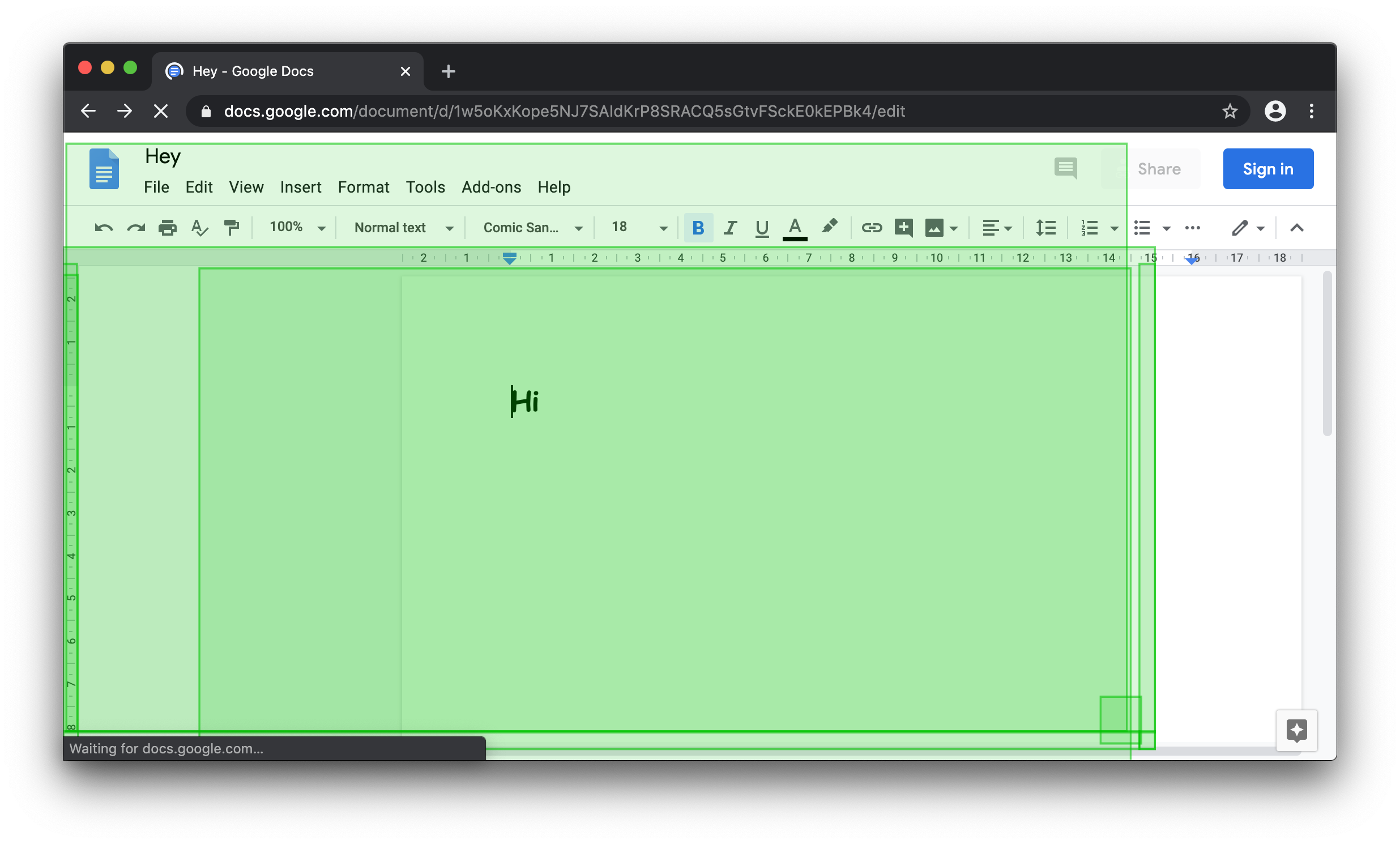
Google Docs Paint Area
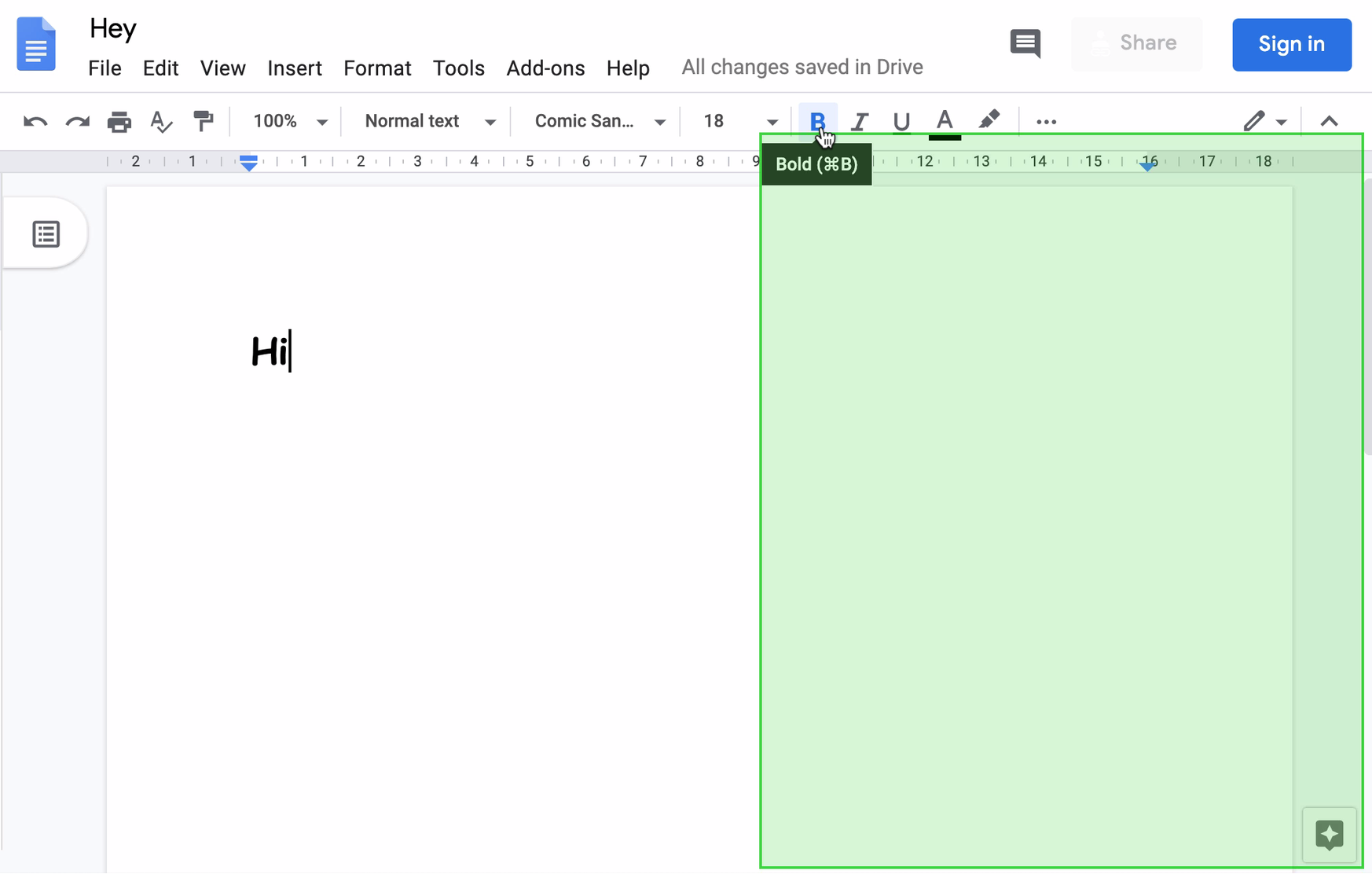
At certain viewport dimensions, hovering over the bold/italic/underline icons presents a bigger paint area than expected. It seems to be the appearence of the tooltip which triggers this.
Using the will-change CSS Property
There's no obvious reason why a tooltip should trigger a larger paint area than necessary, especially since a tooltip is often shown above page components, therefore not affecting the layout of anything else.
As a workaround, we can use the will-change CSS property which hints to the browser that this element may be suitable for layer promotion.
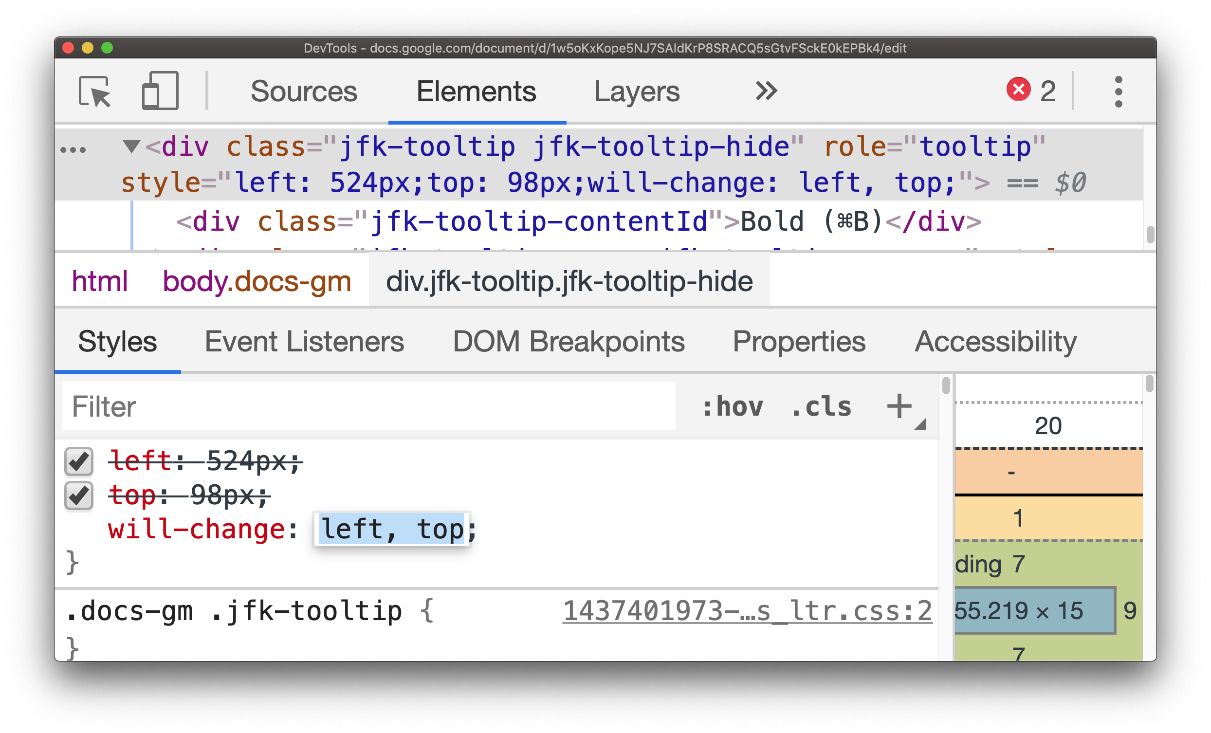
In this particular case, adding will-change results in a reduced paint area as the element is promoted to its own layer.
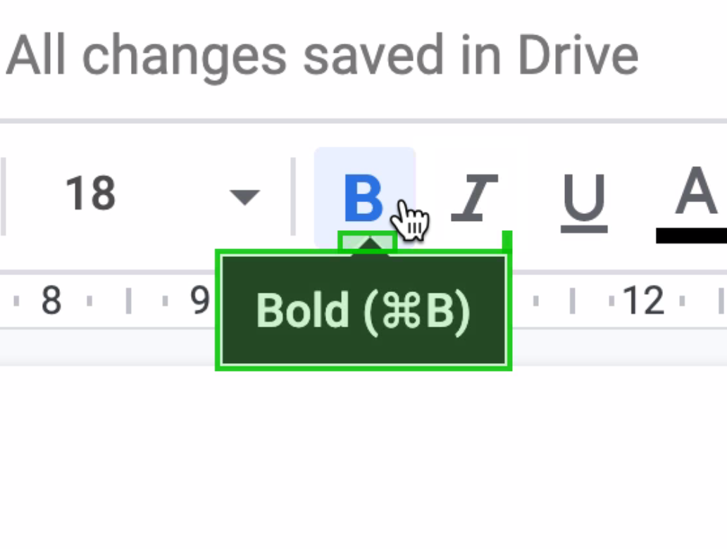
Layers Panel
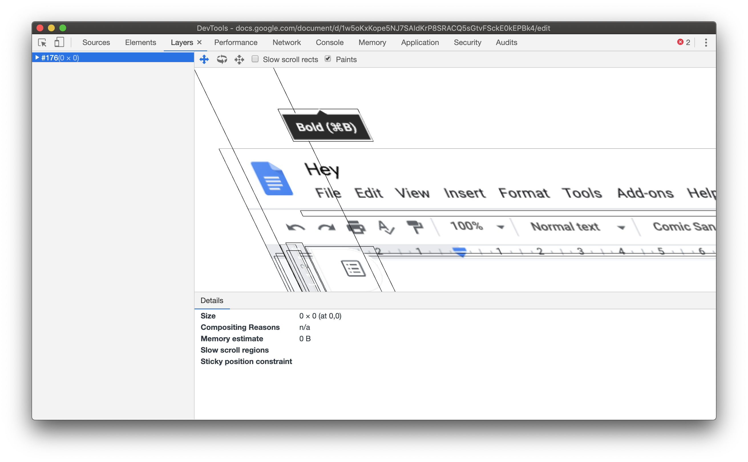
The Layers Panel in DevTools shows how the tooltip is on its own layer.
Conclusion
The less painting a browser has to do, the more performant a webpage will be. Viewing paint rectangles can highlight areas of a webpage which may need investigating. If the entire page flashes green from simply hovering over a hyperlink, it's then worth investigating what CSS (and maybe JavaScript) could be contributing to this.
The will-change trick acted as a potential fix here, but should be used sparingly since excessive layer promotion can be a performance bottleneck, sometimes however, hinting to the browser that an element is "independent" and does not affect other elements, can help in terms of reducing paint areas.